The DataSketches HyperLogLog HllSketch[1][2] implemented in this library has been highly optimized for speed, accuracy and size. The goal of this paper is to do an objective comparison of the HllSketch versus the popular Clearspring Technologies’ HyperLogLogPlus[3] implementation, which is based on Google’s HyperLogLog++ paper[4]. These tests were performed on the HllSketch release version 0.10.1, and on the HyperLogLogPlus version 2.9.5.
The HllSketch sketch has superior error properties compared to the HyperLogLogPlus sketch. This can be easily seen from the following side-by-side comparison. The HllSketch error curves are on the left.
The HyperLogLogPlus error curves are on the right.
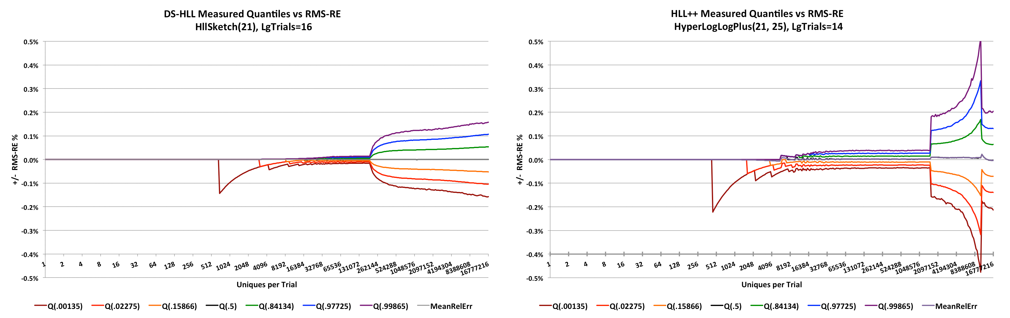
If the image is too small to read, right-click on the image and open it in a separate window.
NOTE: These sketches were configured with K = 2^21, which is a VERY large sketch in order to be able to zoom in on the error detail in the low range, which is where most actual usage will occur.
These plots are what we call pitch-fork plots. The X-axis is the number of unique counts presented to the sketch. The Y-axis is the Root-Mean-Squared of Relative Error (RMS-RE)[5] plotted as +/- percent where values above zero represent an overestimate and values below zero represent an underestimate.
The colored curves represent different quantile contours of the empirical error distribution. The orange and green curves are the contours corresponding to +/- one standard deviation from the mean error, and which define the 68% confidence bounds. The red and blue curves are the contours at +/- two standard deviations and define the 95.4% confidence bounds. The brown and purple curves are the contours at +/- three standard deviations and define the 99.7% confidence bounds. The mean (gray) and median (black) overlap each other and hug the axis close to zero.
Measuring the error properties of these stochastic algorithms is tricky and requires a great deal of thought into the design of the program that measures it. Getting smooth-looking plots requires many tens of thousands of trials, which even with fast CPUs requires a lot of time. The code used to produce the data for the plots in this paper can be found on the characterization repository
For accuracy purposes, the HllSketch sketch is configured with one parameter, Log_2(K) which we abbreviate as LgK. This defines the number of bins of the final HyperLogLog-Array (HLL-Array)[6] mode, and defines the bounds[7] on the accuracy of the sketch as well as its ultimate size. Thus, specifying a LgK = 12, means that the final HyperLogLog mode of the sketch will have k = 212 = 4096 bins. A sketch with LgK = 21 will ultimately have k =2,097,152 bins, which is a very large sketch.
Similarly, the HyperLogLogPlus sketch has a parameter p, which acts the same as LgK.
An important property of a well-implemented HyperLogLog sketch is the error per bit of storage space for all values of n, where n is the number of uniques presented to the sketch. It would be wasteful to allocate the full HLL-Array of bins when the sketch has been presented with only a few values. As a result, typical implementations of these sketches have a sparse mode, where the early counts are encoded and cached. When the number of cached sparse values reaches a certain threshold (depending on the implementation), the sparse representations are flushed to the full HLL-Array. After this transition all new arriving input values are directly offered to the HLL-Array. The HLL-Array is effectively fixed in size thereafter no matter how large n gets. Thus, the sparse mode of operation allows the sketch to maintain a low error per stored-bit ratio for all values of n. We will compute this Measure of Merit for both sketches.
Both the HllSketch and the HyperLogLogPlus sketches have a sparse mode. The sparse mode is automatic for the HllSketch sketch, but the HyperLogLogPlus sketch requires a second configuration parameter sp. This is a number with similar properties to p. It is an exponent of 2 and it determines the error properties of the sparse mode. The documentation states that sp can be zero, in which case the sparse mode is disabled, otherwise, p <= sp <= 32. This will become more clear when we see some of the plots.
As stated above, the X-axis is n, the true number of uniques presented to the sketch. The range of values on this X-axis is from 1 to 224. There are 16 trial-points between each power of 2 along the X-axis (except at the very left end of the axis where there are not 16 distinct integers between the powers of 2). At each trial-point, 216 = 65536 trials are executed. The number of trials per trial-point is noted in the chart title as LgT=16. Each trial feeds a new sketch configured with either LgK=21 or p=21, which is 221 = 2,097,152 bins. This is noted in the chart title as LgK=21 or p=21. The program ensures that no two trials use the same uniques.
The Y-axis is a measure of the Relative Error of the sketch, where
RE = Relative Error = Measured / Truth - 1.0
Since these sketches are stochastic, each trial will produce a probabilistic estimate of what the true value of n is. If the estimate is larger than n it is an overestimate and the resulting RE will be positive. If the estimate is an underestimate, the RE will be negative.
It is not practical to plot billions of RE values on a single chart. What we plot instead are the quantiles at chosen Fractional Ranks (FR) of the error distribution at each trial-point. When the quantiles at the same FR are connected by lines they form contours of the error distribution. For example, FR = 0.5 defines the median of the distribution. In these plots the median is black and mostly hidden behind the mean, which is gray, both of which hug the X-axis close to zero.
At each X-axis trial-point the specified number of trials are executed. For each trial the number of uniques defined by the trial-point are offered (or updated) to the sketch under test. At the end of each trial the cardinality estimate is retrieved from the sketch and stored. At the end of the set of trials at the trial-point the statistics of the distribution of estimated cardinality values are computed.
From the cardinality estimate data of each trial-point, six different FR values have been chosen in addition to the median (0.5). These values correspond to the FR values of a Standard Normal Distribution at +/- 1, 2, and 3 Standard Deviations from the mean. These FR values can be computed from the CDF of the Normal Distribution as
FR = (1 + erf( s/√2 ))/2, where s = standard deviation.
The translation from +/- s to fractional ranks is as follows:
| Std Dev (s) | Fractional Rank (FR) |
|---|---|
| +3 | 0.998650102 |
| +2 | 0.977249868 |
| +1 | 0.841344746 |
| 0 | 0.5 |
| -1 | 0.158655254 |
| -2 | 0.022750132 |
| -3 | 0.001349898 |
With sufficiently large values of n and k, the error distribution will approach the Normal Distribution due to the Central Limit Theorem. The resulting quantile curves using the above FR values allows us to associate the error distribution of the sketch with conventional confidence intervals commonly used in statistics.
For example, the area between the orange and the green curves corresponds to +/- 1 Standard Deviations or (0.841 - .158) = 68.3% confidence. The area between the red and the blue curves corresponds to +/- 2 Standard Deviations or (0.977 - 0.023) = 95.4% confidence. Similarly, the area between the brown and the purple curves corresponds to +/- 3 Standard Deviations or (0.998 - 0.001) = 99.7% confidence. This implies that out of 65,536 trials, about 196 (0.3%) of the estimates will be outside the brown and purple curves.
The mathematical theory[8] behind the HyperLogLog sketch predicts a Relative Standard Error (RSE) defined as
RSEHLL = F / √k.
From Flajolet’s paper and using his estimator, F = √(3 ln(2) - 1) ≈ 1.03896.
When calculating the error from the trial set of estimates we compute the Root Mean Square of the Relative Error or RMS-RE. The RMS is related to the RSE as follows:
RSE2 = σ2 = 1/n Σ(xi - μ)2 = Σ((xi)2) - μ2, where xi = REi.
RMS2 = Σ((xi)2)
This means that the RSE can be computed from the RMS via the mean and visa-versa:
RMS2 = RSE2 + μ2
If the mean is indeed zero then RMS = RSE.
The reason we use the RMS calculation is that it takes any bias into account, while a RSE calculation would not.
We chose a very large sketch for these experiments where LgK = p = 21 so that the behavior of the sparse mode and the final HLL-Array mode can be easily observed.
This means that from the theory, a sketch of this size using Flajolet’s estimator will have an RSE of
RSE = 1.03896 / √(221) ≈ .0007174 = 717.4 ppm
Any HLL sketch implementation that relies on the Flajolet HLL estimator will not be able to do better than this.
With the discussion of how these plots are generated, the plot of the accuracy of HllSketch sketch is as follows:
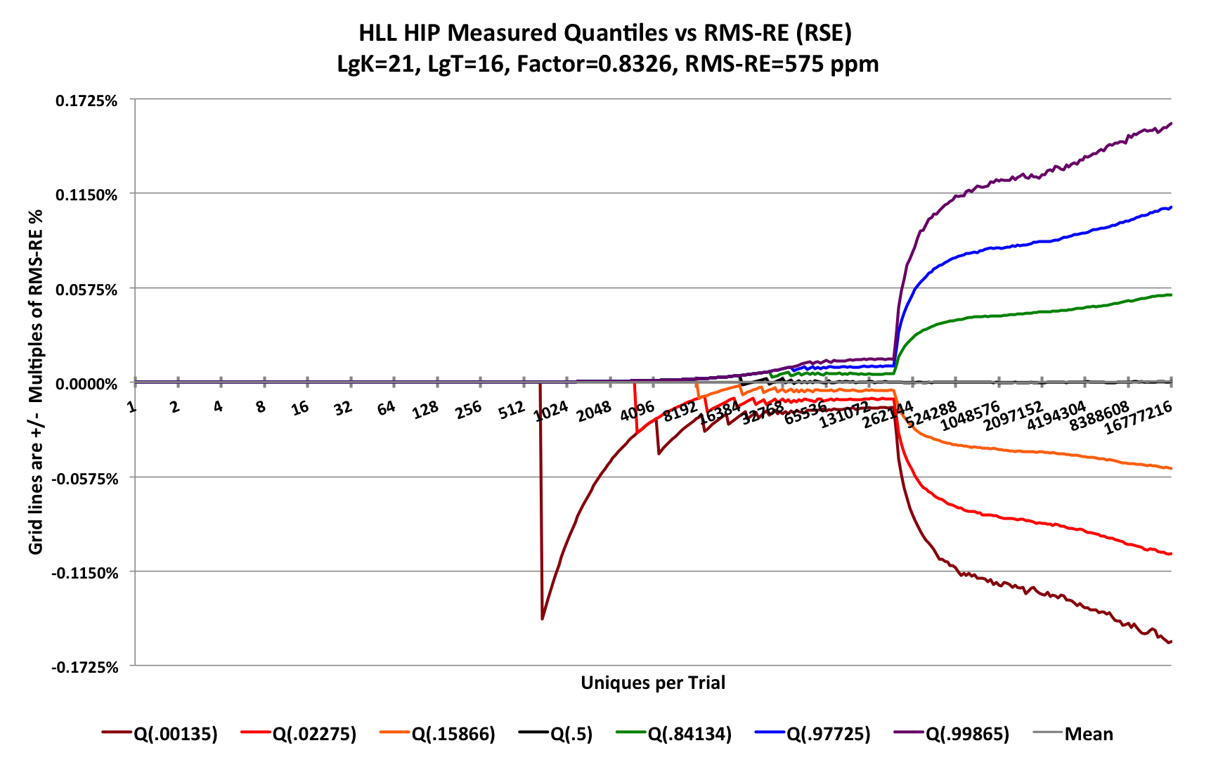
For the right-hand portion of the plot where the sketch is in HLL-Array mode, instead of the Flajolet estimator, the HllSketch uses the newer Historical Inverse Probability (HIP) estimator[9] where F = 0.8326 resulting in an RSE = 575 ppm. This represents a 20% improvement in error over the Flajolet estimator.
The gridlines in this plot are at set to be multiples of the predicted RSE of the sketch. Note that each of the curves appears to be approaching their respective gridline. The green curve is approaching the first positive gridline, and the orange curve is approaching the first negative gridline, etc. These curves will actually asymptote to these gridlines, but we would have to extend the X-axis out to nearly 100 million uniques to see it. Because this would have taken weeks to compute, we won’t show this effect here. It would be more obvious with much smaller sketches.
(To generate this plot required >1012 updates and took 9 hours to complete.)
Starting from the left, the error appears to be zero until the value 693 where the -3 StdDev curve (Q(.00135)) drops suddenly to about 0.14% and then gradually recovers. This is a normal phenomenon caused by quantization error as a result of counting discrete events, and can be explained as follows.
At the trial-point 693 there are exactly 693 unique values presented to a single sketch and then its cardinality estimate is retrieved. This is repeated for every trial for 65,536 trials. The input values presented to the sketch are all unique, however, the internal representation of these input values has a finite precision of about 26 bits. The probability of two different input values producing the same 26-bit value, thus a collision, is determined by the Birthday Paradox, which in this case would predict a collision roughly once in √(226) = 8192 uniques. When this occurs, the sparse mode of the sketch rejects the input unique value as a duplicate when it actually is not. Thus, the sketch undercounts by one. Without collisions all the 65,536 values would be the correct value of 693. When collisions occur, some small fraction of these values become 692. When more than 0.135% of the total trials have have experienced one or more collisions, the quantile value at the Q(0.00135) contour will suddently jump from 693 to 692. This difference of one out of 693 is 0.144% which is the error value at that point. This is a perfectly normal occurrence for any stochastic counting process with a finite precision.
Moving to the right from this first downward spike reveals that this same quantization phenomenon occurs eventually on the the Q(.02275) contour and then later on the Q(.15866) contour. The impact is smaller for these higher contours because the unique counts are significantly higher and the impact of the addition of one more collision is proportionally less.
Continuing to move to the right in the unique count range of about 32K to about 350K we observe that the 7 contours become parallel and smoother.
To explain what is going on in this region we need to zoom in.
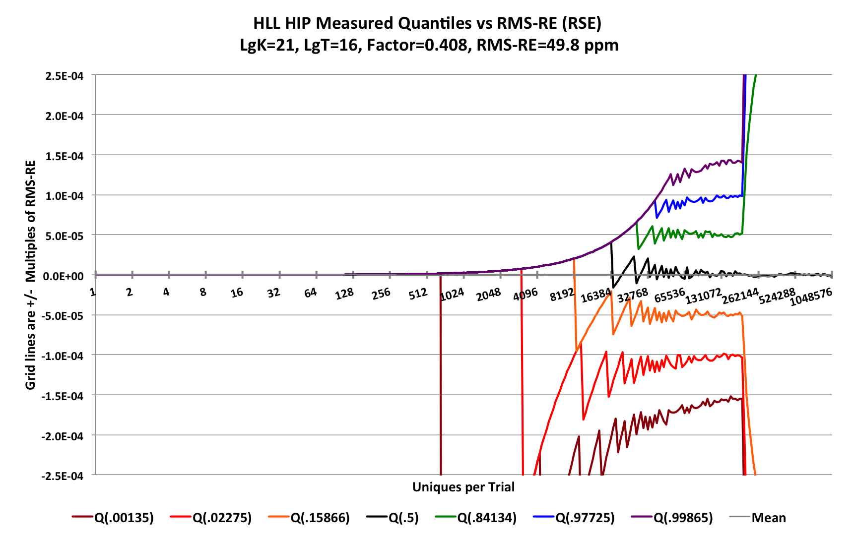
For this zoomed in plot each gridline is again multiples of the RMS-RE (or RSE-RE), but here the factor F = 0.408 due to discoveries of new classes of estimators[10]. With the precision of 226, the predicted RSE is 0.408 / 213 = 49.8 ppm or about 50 ppm. And as you can see the 7 quantile contours nicely approach their predicted asymptotes.
All of this demonstrates that the sketch is behaving as it should and matches the mathematical predictions.
Let’s see how the HyperLogLogPlus sketch behaves under the same test conditions. Here LgK = p = 21 and sp = 25.
There is one caveat: Because the HyperLogLogPlus sketch is so slow, We had to reduce the number of trials from 65K to 16K per trial-point and it still took over 20 hours to produce the following graph:
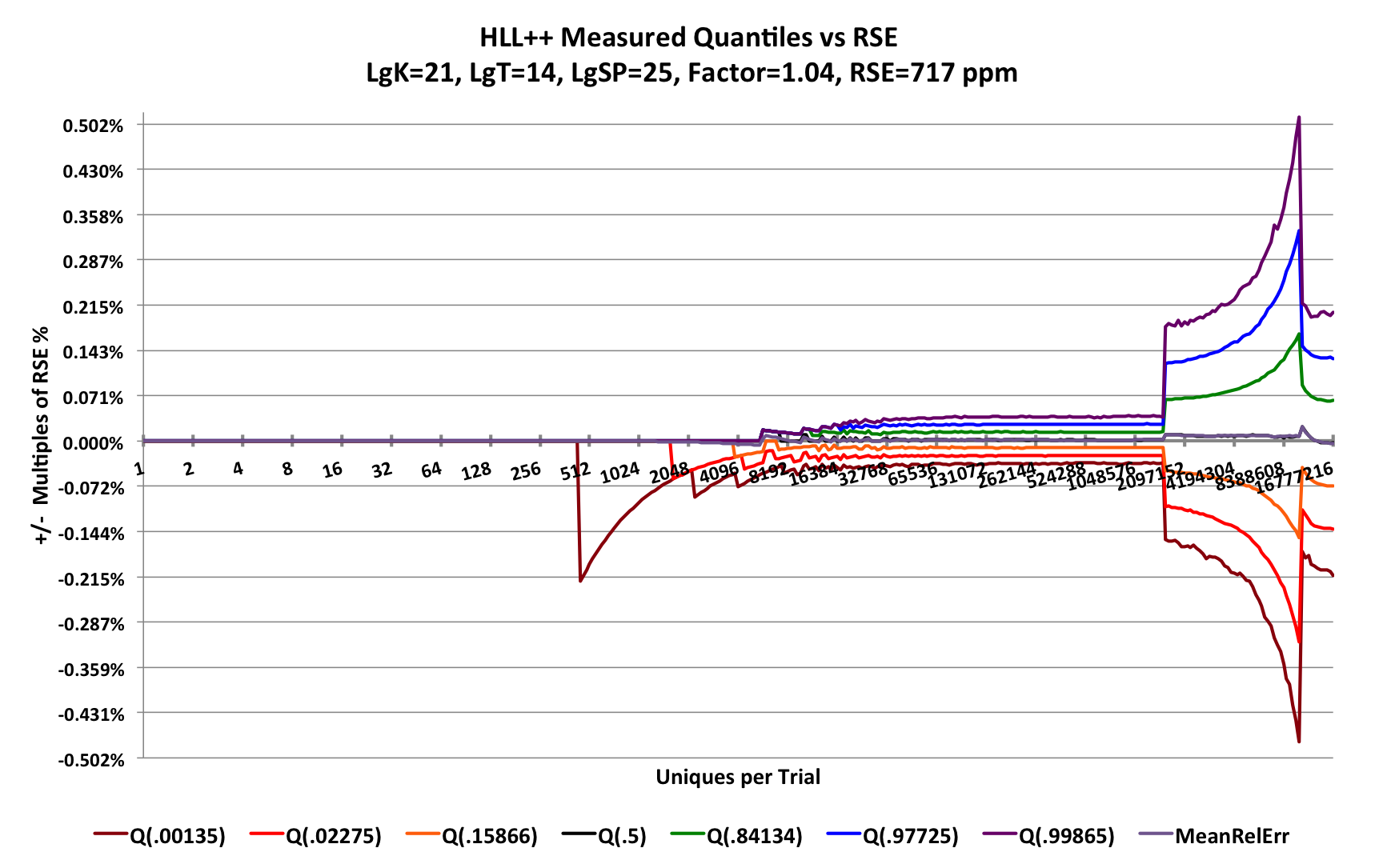
Look closely at the Y-axis scale, for this plot the Y-axis ranges from -0.5% to +0.5%. Compare the scale for the HllSketch plot where the Y-axis ranges from -0.1725% to +0.1725%! The gridlines are spaced at an RSE of 717 ppm while the HllSketch sketch RSE and gridlines are spaced at 575 ppm. However, something is clearly amiss with the HyperLogLogPlus internal estimator which causes the estimates to zoom up exponentially to a high peak before finally settling down to the predicted quantile contours.
The plot below is the close-up of the sparse region of the HyperLogLogPlus. The sparse mode is indeed behaving with a precision of 25 bits, specified by sp.
Here the predicted RSE = 0.707 / √225 = 122 ppm, which is 2.2 times larger than that of the HllSketch sketch at 49.8 ppm.
The factor 0.707 = 1/√2 comes from the use of the “bitmap” estimator[10].
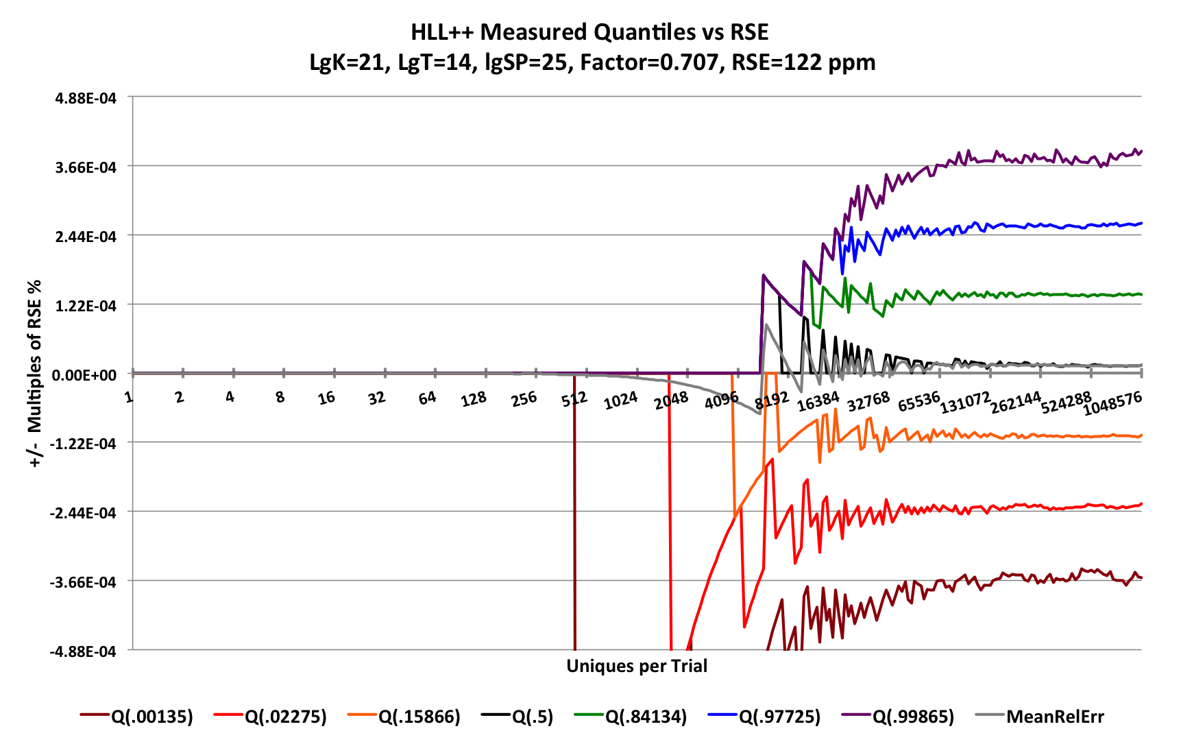
The HyperLogLogPlus documentation claims that sp can be set as large as 32. However any value larger than 25 causes dramatic failure in estimation.
The following demonstrates what happens with a much smaller sketch of LgK = p = 14 and sp = 26.
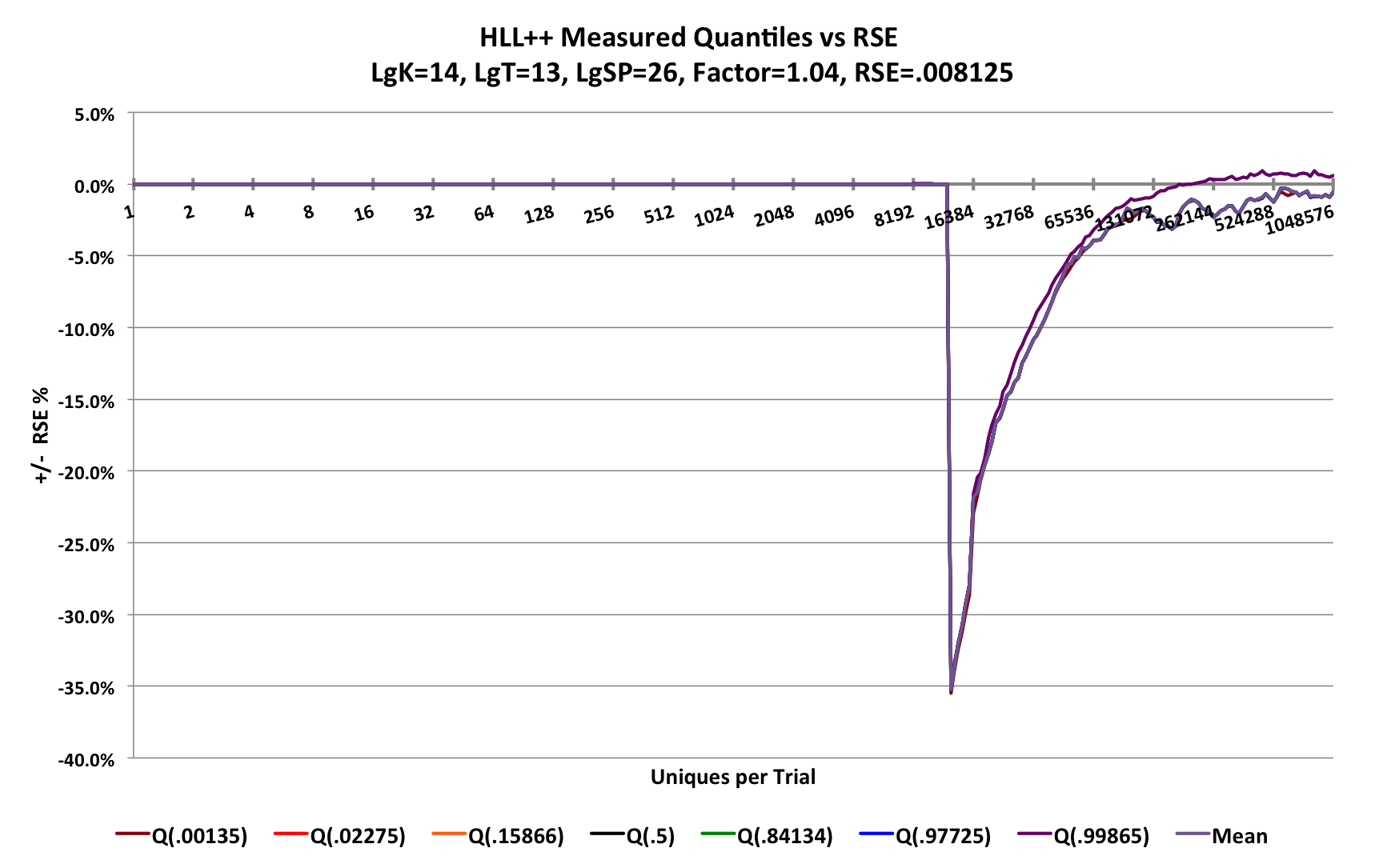
The sketch fails when attempting to transition from sparse mode to normal HLL mode at about 3/4 K = 12288 uniques. The error dives to - 35% when a sketch of this size should have an RSE of 0.8%. The sketch provides no warning to the user that this is happening!
As described earlier, RSEHLL = F / √k. If at every trial-point along the X-axis we multiply the measured RSE by the square-root of the serialized sketch size, we will have a Measure of Merit of the error efficiency of the sketch. For HLL-type sketches and large n this value should be asymptotic to a constant. In HLL-Array mode the space the sketch consumes is constant and the relative error will be a constant as well. Ideally, as the sketch grows as a function of n, the Measure of Merit in sparse mode and in HLL-Array mode will never be larger than its asymptotic value for large n.
This next plot computes this Measure of Merit for both the HllSketch sketch and the HyperLogLogPlus sketch.
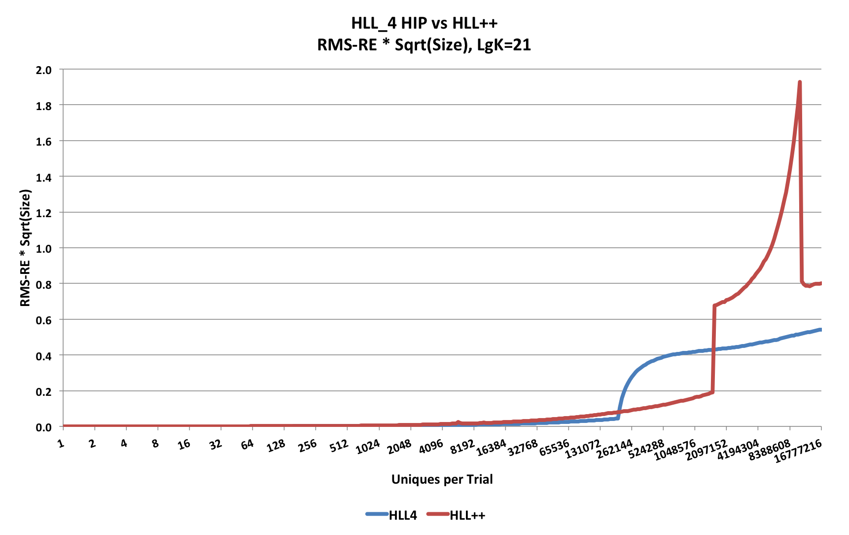
Observe that the HllSketch sketch is lower (i.e, better merit score) than the HyperLogLogPlus sketch except for the region that is roughly from 10% of k to about 3k/4, where the the HyperLogLogPlus sketch is better. This is because the designers of the HyperLogLogPlus sketch chose to do compression of the sparse data array every time a new value is entered into the sketch, which needs to be decompressed when an estimate is requested.
The advantage of compression is that it allows the switch from sparse to normal HLL-Array mode to be deferred to a larger fraction of k. But this decision comes with a severe penalty in the speed performance of the sketch. Opting out of using sparse mode will achieve higher speed performance, but at the cost of very poor Measure of Merit performance for small n.
Above 3k/4, the HyperLogLogPlus sketch is not only considerably worse, but it fails the objective of always being less than the asymptotic value.
Fortunately, the Update Speed performance is much easier to explain and show.
For these tests, at each trial point the sketch under test is presented with the number of uniques at that trial-point and the total time for the trial is measured, then divided by the number of uniques. This produces a measure of the time required per update. Also, we use a more moderate sized sketch of LgK = p = 12 that is more typical of what might be used in practice. The HllSketch has 3 different types (HLL_4, HLL_6, and HLL_8) representing the respective sizes of the HLL-Array bins in bits. The speed behavior of all three of these types is very similar.
This first plot compares the resulting update speed.
Note the Y-axis scale is 250 nanoseconds.
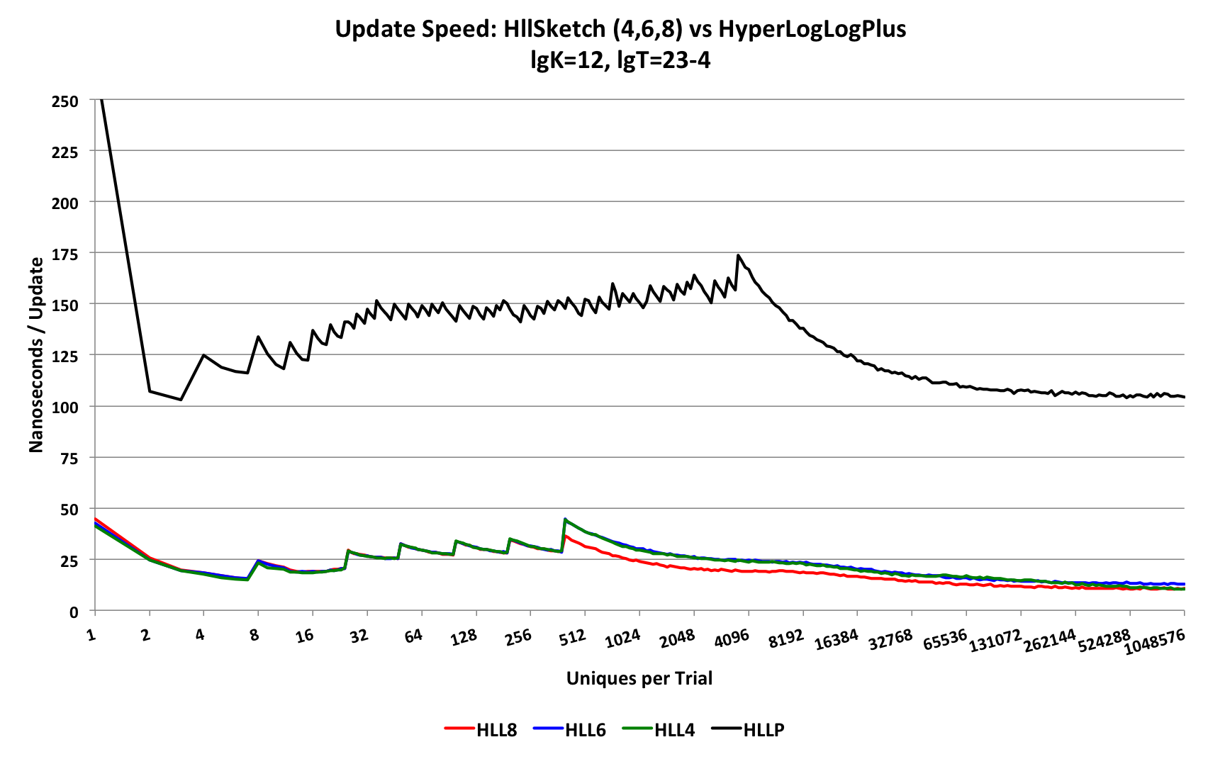
The top black curve is the update speed performance of the HyperLogLogPlus sketch, which asymptotes at about 105 nanoseconds. The lower curves are the update speed performance of the HllSketch, of which the HLL_8 and HLL_4 types asymptote to 10.5 nanoseconds.
This can be seen from a plot of just the HllSketch speed performance curves below.
Note the the Y-axis scale is now 50 nanoseconds.
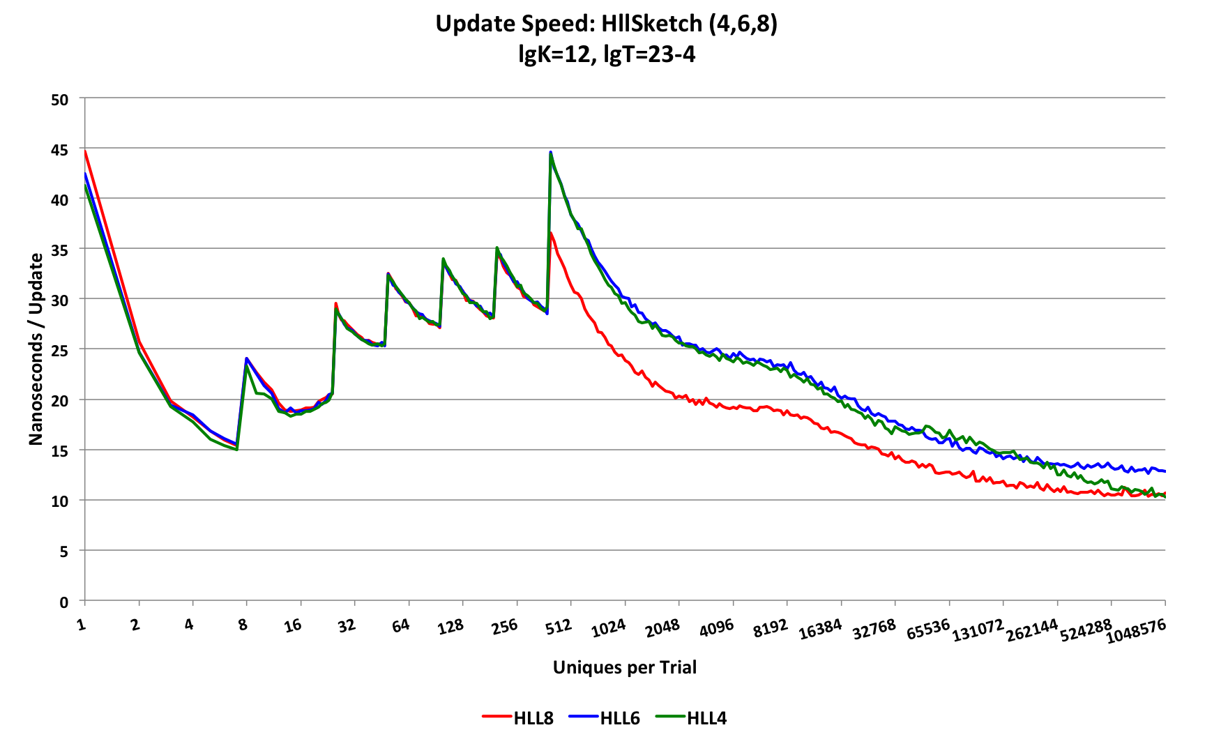 The HllSketch is 2 orders-of-magnitude faster than the HyperLogLogPlus sketch.
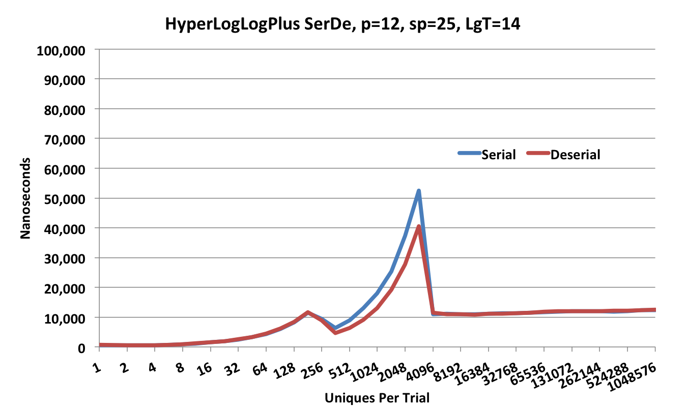
The serialization and deserialization (ser-de) speed of the HyperLogLogPlus sketch is shown in the following plot.
Note that the Y-axis scale is 100,000 nanoseconds.
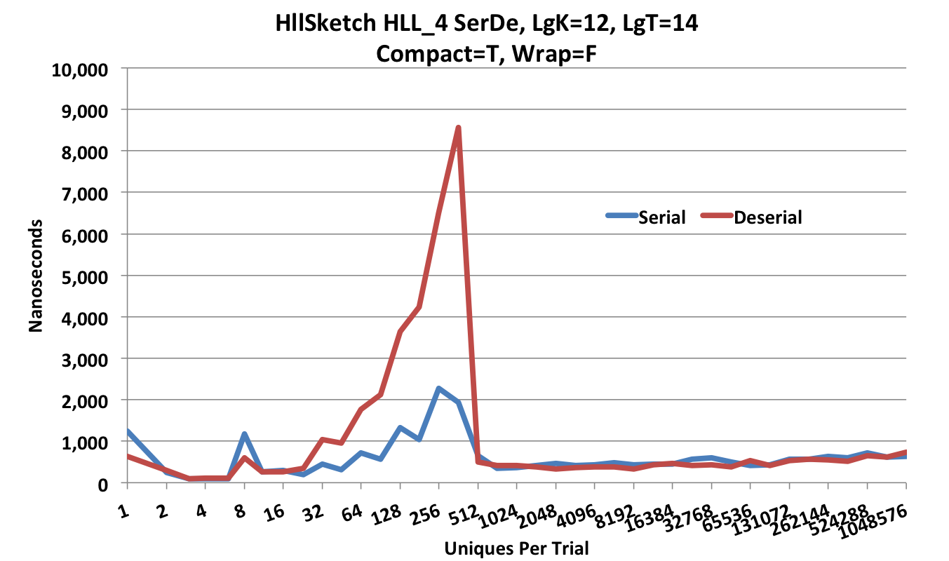
This next plot is the ser-de speed of the HllSketch in compact HLL_4 mode.
Note that the Y-axis scale is now 10,000 nanoseconds.
The HllSketch provides multiple options for serialization and deserialization.
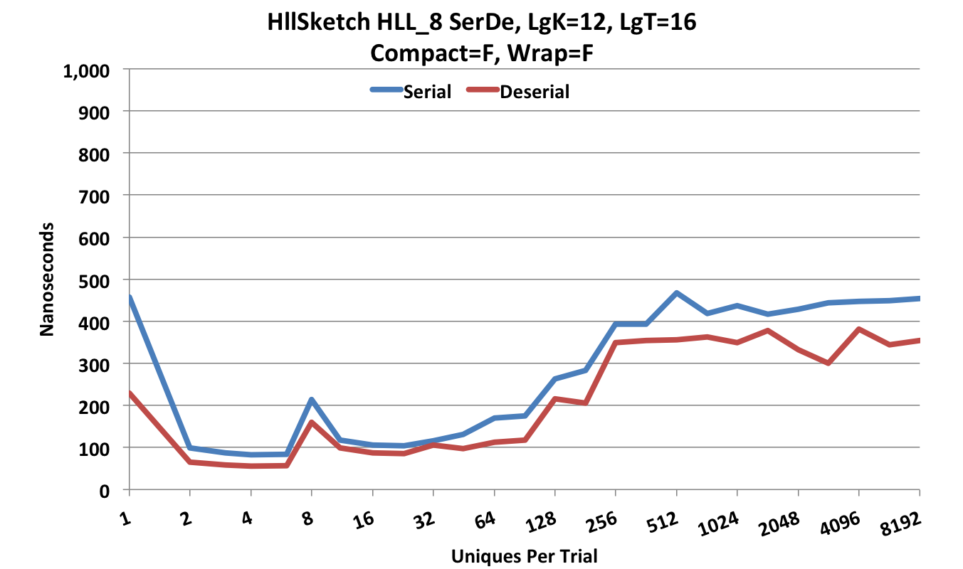
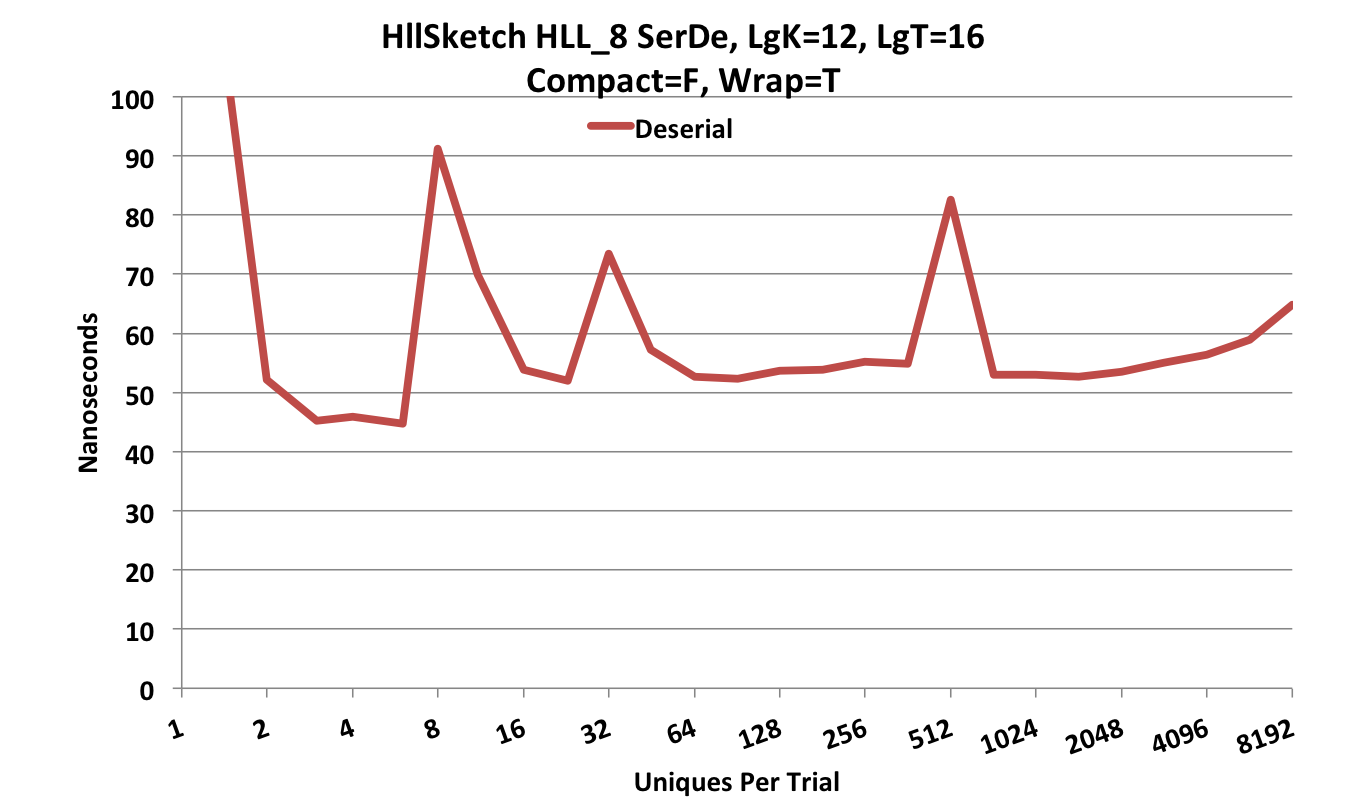
The following ser-de is performed in Updatable form (Compact = false) which is much faster and requires a little more space.
Note that the Y-axis scale is now 1,000 nanoseconds.
In addition the HllSketch can operate fully off-heap.
In this mode, there is effectively no serialization, since the sketch can be updated off-heap.
The “deserialization”, when required, is just a wrapper class that contains a pointer to the off-heap data structure.
This deserialization is quite fast as shown in this next plot.
Note that the Y-axis scale is now 100 nanoseconds. Some of the peaks in these plots are due to GC pauses by the JVM.
Presenting the various HllSketch deserialization modes along with the HyperLogLogPlus sketch deserialization produces the following plot.
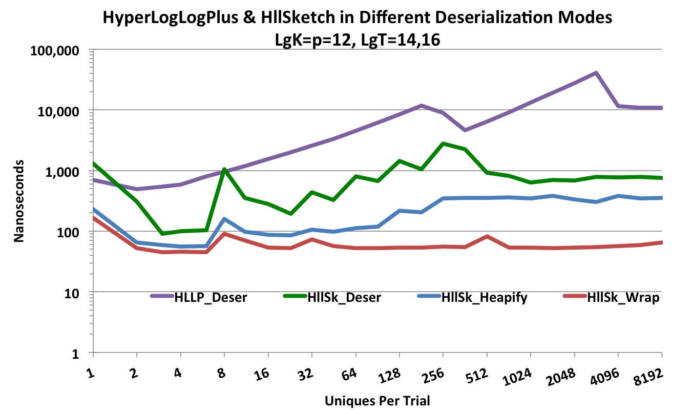
Depending on the chosen configuration, the HllSketch can be from one to almost three orders-of-magnitude faster than the HyperLogLogPlus sketch.

